
Color is the most powerful communication tool in design. A user visiting a website makes a subconscious decision within the first 90 seconds, and 62-90% of that decision is based solely on colors. Understanding and strategically using color psychology affects everything from brand perception to conversion rates.
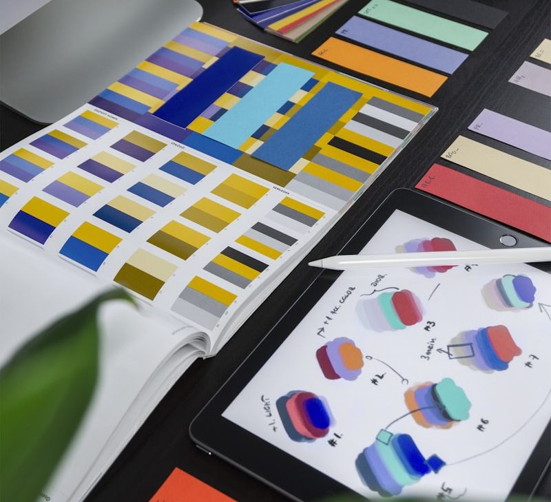
Psychological Effects of Colors
| Color | Associations | Use Case | Brands |
|---|---|---|---|
| 🔵 Blue | Trust, professionalism, calm | Finance, technology, healthcare | Facebook, LinkedIn, PayPal |
| 🔴 Red | Energy, urgency, passion | Food, entertainment, sports | YouTube, Netflix, Coca-Cola |
| 🟢 Green | Nature, growth, balance | Environment, finance, health | Spotify, Starbucks, WhatsApp |
| 🟡 Yellow | Optimism, attention, warmth | Warnings, children, creativity | IKEA, McDonald’s, Snapchat |
| 🟣 Purple | Luxury, creativity, wisdom | Premium, beauty, education | Twitch, Cadbury, Yahoo |
| 🟠 Orange | Fun, boldness, approachability | E-commerce, food, sports | Amazon, Fanta, SoundCloud |
Color Harmony Rules
The 60-30-10 Rule
The golden ratio of successful color palettes:
- 60% Dominant color: Background and general area (usually neutral)
- 30% Secondary color: Cards, sidebars, section backgrounds
- 10% Accent color: CTA buttons, links, important elements
Color Harmony Models
- Complementary: Opposite colors on the color wheel — high contrast
- Analogous: Adjacent colors — harmonious and calm
- Triadic: Three colors at 120° intervals — vibrant and balanced
- Monochromatic: Different tones and saturations of a single color — sophisticated
Conversion-Focused Color Usage
Color choice in CTA (Call-to-Action) buttons can affect conversion rates by up to 21%:
- CTA color should contrast with the page’s dominant color
- Red and orange buttons generally achieve the highest click rates
- Green is effective for confirmation and proceed actions
- Use A/B testing to determine the most suitable color for your target audience
Percentage of first impressions based on colors
Source: Impact of Color on Marketing, CCICOLOR
Dark Mode Design
Dark mode reduces eye strain and saves battery on OLED screens. For effective dark mode:
- Use dark gray (#121212) instead of pure black (#000)
- Prefer light gray (#E0E0E0) over pure white for text
- Express elevation through color lightness (higher elements are lighter)
- Optimize your color palette separately for dark mode
Conclusion
Color selection should be a strategic decision, not an intuitive one. A color palette created by evaluating brand identity, target audience psychology, and conversion goals together will multiply the impact of your digital presence. The TAGUM design team develops data-driven color strategies for your brand.